Firstly congratulations to Gerhard Ritter on winning a first prize at the Kapunda Art Show. Gerhard is a brilliant artist, especially at doing portraits, and we are very lucky to have him as a member our Port Community Arts Centre. If you would like to view the winning painting and some of his other work his site is at
http://ritterart.blogspot.com/2011/08/kapunda-exhibition-flashback.html?spref=tw
and it is well worth taking the time to browse through it.
The other day my best friend Rosemary and I were fortunate enough to attend a demonstration of pastel drawing given by well known Adelaide artist Trevor Newman. We both like his work so it was really great to see him actually creating a picture for us, right before our eyes. If you are not familiar with his work and can handle feeling envious of another artist then check it out at http://trevornewmanartist.com/
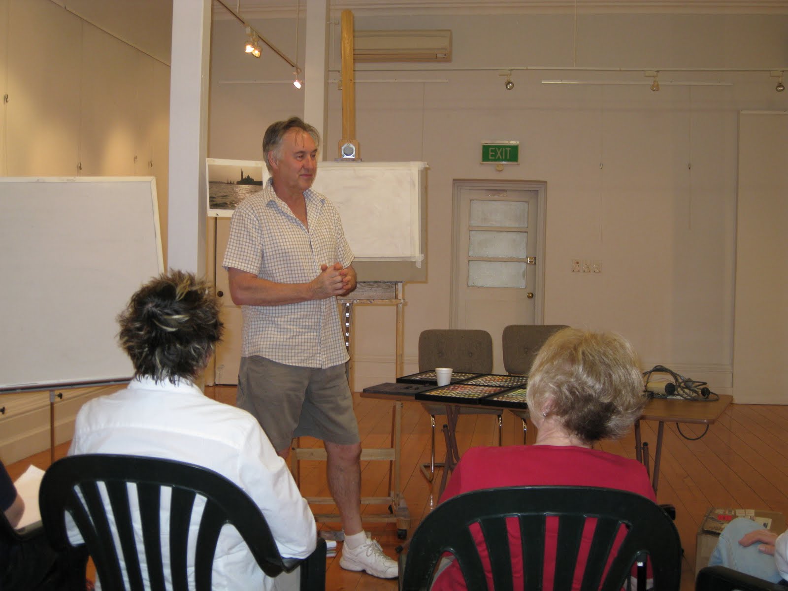 | |
| Trevor Newman with a photograph from Venice, a blank sheet and a captive audience |
Anyway, Mr Newman who was suffering with a cold but nevertheless turned up (bless him), was laden with a series of boxes full of recently purchased pristine pastels, each of which when opened dazzled us with an array of beautiful colours. It had my friend Rosemary (who is learning pastel drawing) as well as the other pastel artists amongst us (which I am not) drooling with envy. The pastels (hundreds of them) were Unison Pastels which are a hand rolled (whatever that means) English brand which you can purchase cheaper from the US than the UK (figure that one out!). He had a few mostly darker colours in other brands, but Unison is his brand of choice. When I asked him what other brands he considered were acceptable he said that Sennelier and Schmincke were OK (guess I better ditch my old MontMarte set which is currently collecting dust in my studio).
http://www.unisoncolour.co.uk/content.aspx?Page=home
http://www.schmincke.de/produkte/pastels.html?L=1
http://www.sennelier.fr/en/pastel_ecu/pastel_cardboardboxes.php
 |
| An amazing array of colours from which to choose! |
Anyway I gather it is something maybe called colour fix clear pastel primer and it makes the surface rough which is apparently good if you are using chalk pastels. Normal masking tape was used for the border, however we were advised that the blue painters tape is actually better.
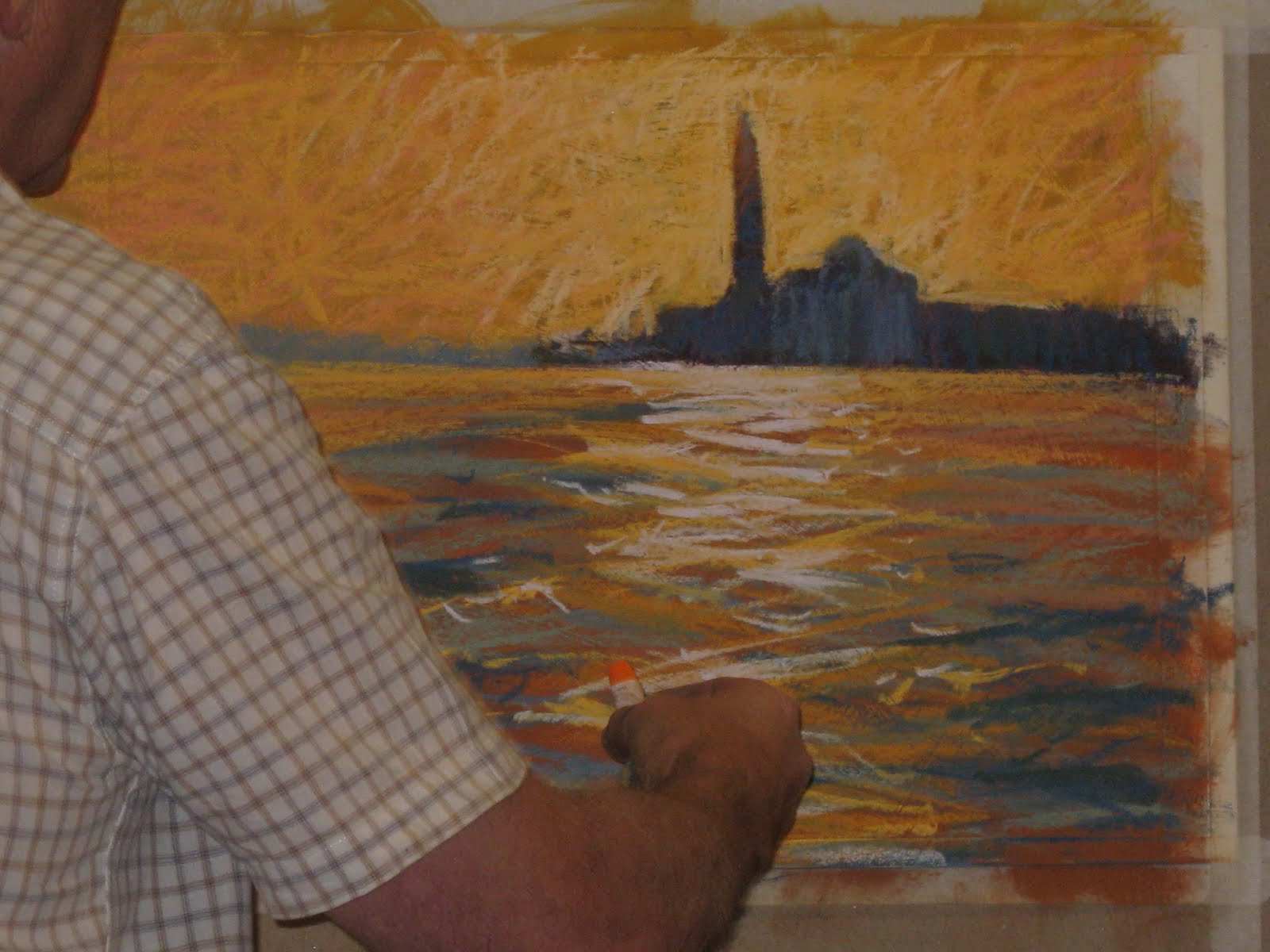
There was only a short time for this demo and the painting to be created was from a photograph taken somewhere famous in Venice. In the photo there was a sunset sky and lots of water with lovely waves and reflections in the foreground.
Trevor pointed out that this would not be an exact representation of the photo. He advised that the colours as recorded by the camera can often be different to how we see them and that this would be an interpretation of what he saw when he visited the location.
 |
| Firstly the sky.... |
 |
| Then the buildings.... |
 |
| Then the sea... |
He continued adding a variety of yellow, orange, purple and grey shades to different areas of the paper, only leaving a white area where the reflections on the water were to be.
 | |
| Trevor checking his bold scribbly lines before proceeding to the next step. |
 |
| Metho being applied to the sky... |
I looked at what he had created and thought, "whoohoo, I can do that!" Next, much to my surprise he picked up a paint brush and proceded to paint over the picture with methylated spirits.
 |
| And now to the sea... |
He used a wide brush to push the pastel colours around on the canvas. Apparently acetone is better than methylated spirits, but he had chosen not to use it because of the fumes. The metho takes a little longer to dry than the acetone does.
It wasn't long before all of the scribbly lines had disappeared and no white paper was visible.
 |
| Trevor waits for the metho to dry so be can proceed. Sorry about the quality - my little camera doesn't zoom well. |
 |
| Highlighting the spire |
Once it had dried and he was satisfied with the result he started to add lighter tones to the sky around the spire of the building and some blue tones the the front of the buildings to provide colour variation and detail.
After this he started to put some more lighter yellows and oranges in the sky and some shading tones in the sea. Light greyish tones were added between the sky and sea. We were advised that it is best to start in the distance and work forwards, which is why he started on the sky and buildings before the sea.
 |
| Bringing in some greys and darker tones |
Gradually the tones of the sky, sea and buildings began to change before our eyes and you started to get an idea of how the overall picture was going to look. It was really frustrating (to me) to see how skillfully he wielded the pastels so that with just a few quick, deft zig zagging strokes, waves magically appeared. It takes me forever to paint waves with my watercolours and mine certainly don't look as good as his!
 |
| Some light yellows are added to start the reflection detail |
Next the light relecting off the sea had to be added, which was quickly done with with layers of lighter and lighter colour. It always amazes me how just a few curvy little touches in just he right place make something look real. When you go to an art gallery and look closely at a painting it is just a series of blobs or strokes of colour. The trick (which I have yet to master) is the putting of the blobs in the right spot and order. Trevor put his strokes in the right spot with absolute precision and then using the lightest almost white colour, the reflections were done.
 |
| Light almost white colour completes the reflection |
 |
| More orange wave tones, with a dab or two on the sky too.... |
Or so we thought..... Trevor however, had other ideas. After standing back and viewing it from a short distance he decided that it needed the addition of somemore orange and also some more darker colours in the foreground, the further enhance the look of the waves.
 |
| Dark tones in the sea, a little more blue on the buildings. |
By now we were all going "ooo aahh, just look at that" and "damn, why can't I do that" etc. etc. There was an air of awe and admiration in the room (with perhaps a smidge of envy).
I asked Trevor how you fix a stuff up (which is hard to do with watercolours) and he said it was usually pretty easy to do. Generally a stiff brush will remove an incorrect colour, or a damp rag.
 |
| Method for emoving excess chalk dust |
We were advised to go to only good professional framers who know how to frame pastel paintings. The not so good ones spray paintings with fixative to overcome their inability to handle and frame pastels correctly. I was not aware of it, but it seems that good pastels do not fade over time and the life of the colours will probably outlast that of the artist.
 |
| Final inspection! |
 | ||
| I thought it looked good. |
We were almost out of time and I thought this looked good, but after the above inspection Trevor decided that it was a little too detailed and dark where the buildings were, so he added some vertical strokes of lighter colour to it and finally it was finished, as show below.
 |
| Daa daaahhhhh! Venice - the finished article - how good is that eh!? |
 Mr Newman duly signed the painting and when asked what he uses to sign, advised that it varies depending upon the painting, but sometimes he uses a soft charcoal pencil.
We were all suitably impressed with the demo and all the good advice we had received (I should have taken notes) and John Ford (my watercolour teacher) thanked Mr Trevor Newman for kindly giving us such an interesting demonstration. If time had permitted I think we would have all sat and happily listened to/watched him for a lot longer. As it was a demo, the painting was offered for sale there and then and was quickly sold (Ursula beat me to it - drat, drat and double drat!).
 | |
| Section of the waves |
 | |
| Showing toothy texture |
Note the nice "toothy" texture of the primed paper.
 | ||
| Sky and Water |
Loved the way the sky had scribbly marks in it still- great effect and so different to watercolours. I reckon I might just have to get some pastels and have another bash at it.
I would like to thank Rosemary for lending me the notes she took at the demo (so organised!), without which this blog would have been just a collection fuzzy pictures. My apologies to Trevor Newman if anything is incorrect - it was unintentional and can be blamed on advancing senility, which is giving me the retention abilities of the average gnat.
Until next time - cheers all.
Wow! That certainly looks like it was a very interesting demo - Don't you just love watching other artists create? I learn so much that way! Thanks for sharing this in such detail!
ReplyDelete